Sat 11 Mar 2023
For Fonts in My Life
Header image by Andrew Wright
It is dissertation writing season at University, and this means one thing, document creation. There are a few schools of thought when it comes to document creation.
The Office Clerk
A person who will use 12pt Calibri, have headings in 'Blue, Accent 1', and submit it as a .docx file if they can.
Likely records videos in portrait.
The WYSIWYG Wizards
Someone who still uses Microsoft Office but will change font, margins, bullet styles, and may even go as far as designing a custom template.
The Typesetters
Someone who uses dedicated document preparation software. Will spend hours searching for the correct typeface. They spend more time on formatting than on writing. Do not mention Arial in the company of this person.
You will fall somewhere along this spectrum. Most likely somewhere between the first and second. I am here as a counterbalance. To show you why you should care about your documents. But mainly I'm here to gush about typefaces.
Warning, unqualified pretentious font talk ahead!
Words Count
A good typeface can elevate a document to something more than the sum of its parts. A typeface has one purpose, to present text on a page for it to be read. But it is the way in which it achieves this purpose where there is space. Space for creativity, for expression, for sentiment. When I make a document that I want to present, I want that document to say something about me.
The written word is a decidedly constrictive medium for visual creativity. Especially when those words are part of a dull report, or distinctly verbose thesis. The writing itself is the star of the show of course, but that show should be presented in as grand a theatre as possible.

Here I have the same line in the two stalwarts of Microsoft Office, Times New Roman and Calibri. These typefaces lay at opposite ends of design language. One is a traditional Roman style serif designed for a newspaper in the '30s, but inspired by the likes of Baskerville from the 18th century. The other is a humanist sans-serif, designed for digital displays, with edges smooth enough to leave near small children. Each of these have their place (probably), but it is inarguable that Times gives a more powerful presentation of the words of INGSOC.
This is a rather extreme example. Typefaces, like any art, mostly boil down to taste and personal preference. As much as I dislike Calibri, I respect someone's choice to use it. The problem is, people very rarely choose it. They use it because they didn't make a choice, and apathy is the fashion of the meek. If there is one thing I want you to get from this article, it is to make a choice. Let every part of your document's aesthetic be a conscious decision, own your typography.
IBM Plex Sans
As an example of a conscious font choice, I present my use of IBM Plex Sans in bold as something I commonly use as a heading font.

I adore the era of computing when teletypes reigned supreme and graphics were optional. I wouldn't like to live then, you understand. Much in the same way that people idolise the wild west, when in reality it was organised crime mixed with dysentery. I just like the smell I get in my ears when I look at the photographs.
Four of the biggest players in computing during this era were IBM, DEC, Bell Labs (owned by AT&T), and General Electric. IBM were the largest, they developed the first mainframe computers that could be sold in large (for the time) numbers.
Bell Labs were the research powerhouse of the industry. The shear importance of Bell Labs in the history of science and computing cannot be overstated. The transistor, the cosmic microwave background radiation, the laser, the CCD, the concept of bits, C, C++, Unix, nine Nobel Prizes, five turing awards... The list of achievements is astounding and is worthy of several documentaries.
The GE computing division (later sold to Honeywell) and DEC were not as large as IBM but still formed two of DeBUNCH of IBM competitors.
By 1988, the 5 of them would represent the 4th, 6th, 8th, 28th, and 38th largest companies in America. They were by far the largest technology companies of their day and represented the dawn of the information age.
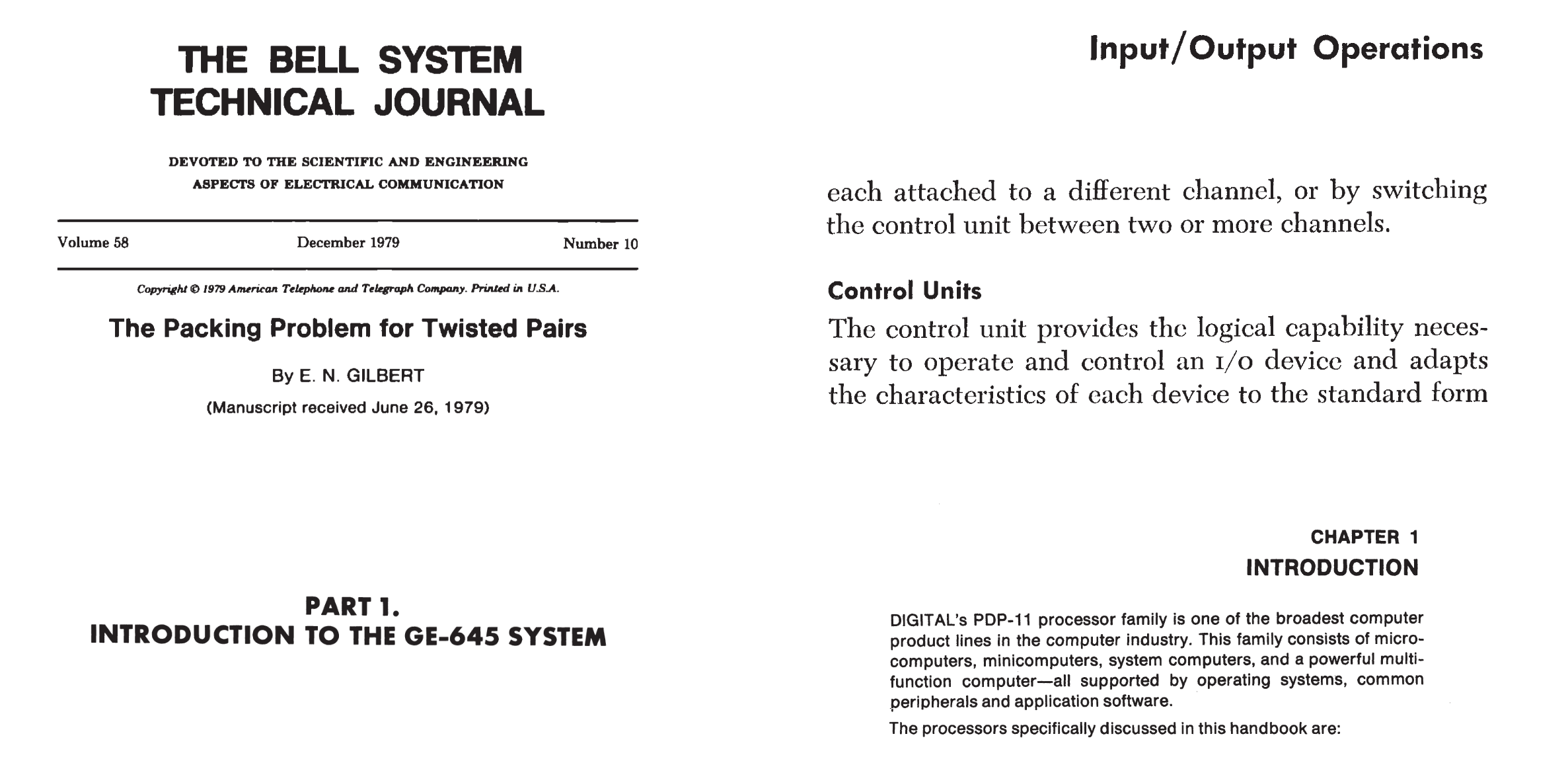
This duality of being the cutting edge modernity and being multinational corporations came through in their typography. Above are excerpts from the Bell System Technical Journal of December 1979, the IBM System/360 user manual, the GE-645 system manual, and the PDP-11 Processor handbook.
Bell and DEC are using the Neo-Grotesque Helvetica, with IBM and G.E using the Geometric Futura.
Helvetica
Helvetica is a typeface that is both lauded and besmirched. Its design is heralded, but it's use as the symbol of modern corporate America meant it hit a level of saturation that has left a sour taste in the mouth of those from a prior generation.

And they are perfectly correct of course. Helvetica found an audience in the large companies of the 80s and 90s. It is non-confrontational, it has no outlandish flair. And the absence of serifs along with its Swiss modernism moves it away from the archaic Garamonds and Caslons of the world. But I think that its use amongst the billion-dollar conglomerates of yesteryear should not be a reason to dismiss this typeface.
For a start, the saturation of Helvetica means that brands have began to move away from it. American Airlines changed its font in 2013. And today's major companies (Google, Tesla, Microsoft) no longer see it as representing modernity. So perhaps it's reasonable to look at why Helvetica was used in the first place.
The strength of helvetica is in the way it can hold its own on a page.

If we compare it against the Humanist Gill Sans, I just feel it sits so much better. It brings an air of German functionalist efficiency that Gill Sans doesn't.
The stand-out character in Helvetica is the capital R. Helvetica feels placed, in position, structurally sound. One of the reasons for this is the way all of its terminals are either perfectly vertical or horizontal. Look at the way the C opposes itself, the tail of the y facing left, and the s finishing straight up and straight down. Helvetica locks itself into place with these, it grabs the page.
On the other hand, Gill Sans, and a lot of humanist typefaces, feel like they're ever so slightly about to fall over. They seem to me like they always need one more letter next to it just to support the previous one. Of course, this run-on nature makes them wonderful for body text. They allow text to flow easily, whereas the rigid nature of helvetica is slightly too uniform to make it nice to read in large chunks. For header text though, Helvetica can reign supreme.
Futura
Speaking of Supreme, Futura. It is what is known as a geometric typeface, it's characters are formed from circles and straight lines. It's foundations in geometry make it a perennial staple in anything wanting to convey as modern or futuristic. Wes Anderson, Stanley Kubrick, and NASA have all made extensive use of its sharp angles and perfect curves.

It's easy to see why it is so popular. It just screams technology. It's abstract characters redefine type in terms of mathematics and the result is something notably artificial.
Man and Machine
 IBM Plex falls into the category of Grotesque fonts.
It shares quite a few similarities with Helvetica and its predecessor Akzidenz-Grotesque.
The main similarity it has with Akzidenz and Futura over Helvetica is its more gothic R with a diagonal leg.
IBM Plex falls into the category of Grotesque fonts.
It shares quite a few similarities with Helvetica and its predecessor Akzidenz-Grotesque.
The main similarity it has with Akzidenz and Futura over Helvetica is its more gothic R with a diagonal leg.
Although it does not share any letter forms with Futura, IBM plex still has a distinct geometric machined quality. Its counters are not perfect circles, but they're not the ovals of more Humanist or Grotesque typefaces either. Characters like C, G, O, and Q all have a stadium shaped counter. Not an elemental shape but still with foundations in geometry. The central "pipe" like leg also has an artificial quality but once again has its roots in machinery rather than formal design. The only real Humanist design choice is the double-storey g. A strange decision thematically, but I think it's little pipe ear is quite charming.
IBM have created a typeface that harks back to the pre-digital age. Just like IBM, the grotesque typeface was born out of the Industrial era and found its greatest success between the 50s and 90s (with Helvetica). It's machined nature doesn't distract either. It manages to be contemporary without being sleek.

Charter
Into the realm of serifs, more specifically serif body typefaces. I'm more of a fan of using a serif for the main text of a document. Some people say it is more readable, I just feel it fits with my more classic, timeless aesthetic.
 Serifs can get a bit tricky to get right because it depends on the context.
Something like Baskerville looks quite beautiful in print.
Its serifs taper thin, and it has a very high stroke contrast that shines on the page of a book.
To see what I mean, look at the capital A.
The left hand side is much thinner than the right.
Serifs can get a bit tricky to get right because it depends on the context.
Something like Baskerville looks quite beautiful in print.
Its serifs taper thin, and it has a very high stroke contrast that shines on the page of a book.
To see what I mean, look at the capital A.
The left hand side is much thinner than the right.
The problem with these older typefaces, designed to look great on paper, is they don't transfer to the digital screen very well. At the lower detail densities of screens, these thin strokes can become hard to read and harm legibility. You will notice that modern serif typefaces designed for screens or home laser printers will have much lower stroke contrast. They also tend to have a slightly higher x-height.
The obvious pairing for IBM Plex Sans should be IBM Plex Serif, right? Well it left me feeling a bit cold. I can imagine using it for UI, but overall I can't gel with its modernism. Its Bodoni-style sharp, rectangle serifs feel a bit too geometric for me. It also has a reasonably tall x-height, moving away from the traditional look that I want.
Charter strikes a good middle-ground. Its x-height is a bit shorter, it's serifs tapered (but not excessively), and a slightly thinner average stroke width from something like Georgia (Also by Matthew Carter).
Of course, I'll chop and change things depending on what a document should look like, but I hope I've given you enough of an introduction into typefaces that you may dip your toe into something other than the default. If you want more guidance on things other than typography then I can't recommend Butterick's Practical Typography enough.
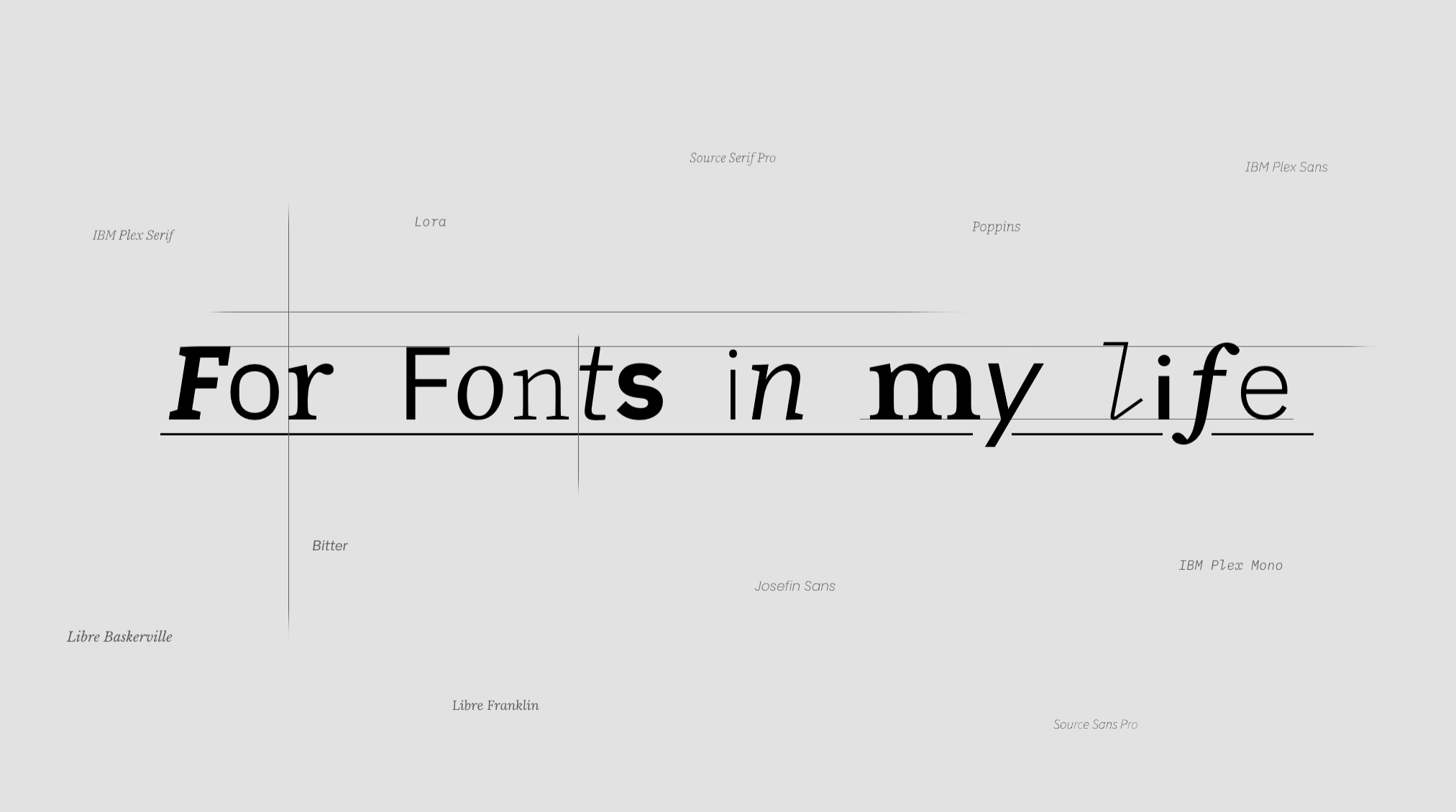
And just for the sake of it, here are some more honorable font mentions.
Serif
Sans-serif